
Rules & Regulations
ADA Sign Colors – What Are My Options?
Apr
It’s officially Spring. The storms have passed, and warm colors are starting to show. All of this vibrancy has got us thinking about other things in beautiful color — YOUR ADA SIGNS IN COLOR CONTRAST!!
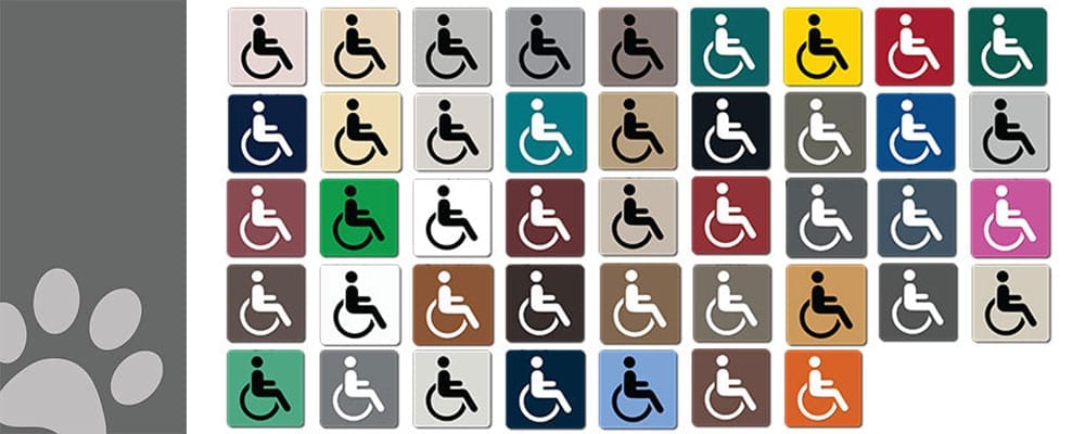
Did you know that color contrast plays a big role in creating ADA compliant signage? So big of a rule that it is a common myth ADA signs must only be blue and white, or black and white. We are here to turn that myth upside down and help bring new life and color to your ADA signage.
There are actually just a few guidelines to follow when picking colors for ADA signs. In their 1992 book Wayfinding: People, Signs, and Architecture , Paul Arthur and Romedi Passini talk about a reliable calculating method to calculate the contrast between two colors. Due to these calculations, an industry “rule-of-thumb” guideline to follow when deciding on your color contrasting options are:
‘a 70% Brightness Differential between sign text and background color‘
But don’t worry — that is only a guideline. In fact, the exact verbiage from the 2010 ADA Standards for Accessible Design states:
“Characters and their background shall have a non-glare finish”
“Characters shall contrast from their background with either light characters on a dark background or dark characters on a light background”
(Learn more about design rules)
So what does that “70% Color Contrast” REALLY mean?
Every color is assigned a Light Reflection (LR) number.
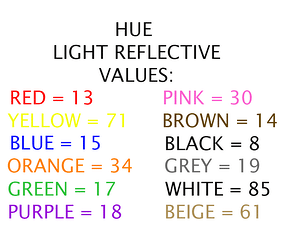
This value tells us how much light the color itself will reflect. Now the contrast formula is based off of these LR readings in percentages for each of the colors involved. We get to these percentages by subtracting the lesser LR value from the greater LR value, divide the difference by the lesser LR value, multiply by 100 and BOOM! We get the Brightness Differential. Back to the industry “rule-of-thumb”, the Brightness Differential value needs to be 70% or higher to be considered acceptable to use.
The Math Breakdown:
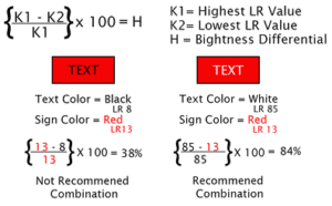
Taking into consideration the wide range of color choices, ambient lighting, and visual impairments, making sure the contrast is there, is important. Following the 70% LR value minimum helps ensure that people with visual impairments can read the sign information.
Thanks to our DCS UV84 printer, we at Alpha Dog ADA Signs, can provide virtually thousands of color combinations which meet ADA Compliant Color Contrast rules! We have the ability to make custom colors and PMS colors and color approximate for the best match, which means you get to enjoy those signs in a whole new color! Let’s be creative together, and show you ADA signs some Spring color.