Every day, ADA compliant signs are designed, specified, and fabricated. Some of these signs are fabricated right and others not so much. The guidelines for ADA signs are not that complicated, but there are key requirements that must be followed to meet ADA signage standards.
The problems we see with non-compliant signs comes from one of two things:
lack of knowledge
ignoring the guidelines to meet a design aesthetic.
ADA Compliance: Violation Penalties
The penalty for the first violation is $75,000 with each additional offense being $150,000…. which is a lot of money that could be going to a different part of your project. Remember, it’s the law and there are people with visual disabilities relying on these signs.
Here are five common signage violations with ADA standards. Keep in mind there are other violations, but these are the ones we see the most.
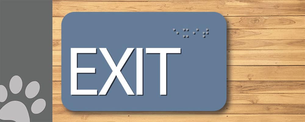
1. FONT: An Okay “F” Word
ADA Signs should be sans serif and the character size is regulated. These sans serif fonts include Futura Medium, Frutiger Bold, Lucida Demibold, Trebuchet Bold, Myriad Pro (which is what we use), Univers Medium, Helvetica, and Arial Bold.
The language in the 2010 Standard for Accessible Design is very straightforward:
“703.2.2 Case. Characters shall be uppercase.703.2.3 Style. Characters shall be sans serif. Characters shall not be italic, oblique, script, highly decorative, or of other unusual forms.703.2.4Character Proportions. Characters shall be selected from fonts where the width of the uppercase letter “O” is 55 percent minimum and 110 percent maximum of the height of the uppercase letter “I”.703.2.5 Character Height. Character height measured vertically from the baseline of the character shall be 5/8 inch (16 mm) minimum and 2 inches (51 mm) maximum based on the height of the uppercase letter “I”.”
ADA Sign with Compliant Font and Braille: There are so many other custom ways to make your ADA signs decorative with the use of color, shape, materials, etc.
“703.1 General. Signs shall comply with 703. Where both visual and tactile characters are required, either one sign with both visual and tactile characters, or two separate signs, one with visual, and one with tactile characters, shall be provided.”
2. KERNING: The Space Between Us
The 2010 Standard says there needs to be a minimum of 1/8” between the two closets points of any tactile characters.
“703.2.7 Character Spacing. Character spacing shall be measured between the two closest points of adjacent raised characters within a message, excluding word spaces. Where characters have rectangular cross sections, spacing between individual raised characters shall be 1/8 inch (3.2 mm) minimum and 4 times the raised character stroke width maximum. Where characters have other cross sections, spacing between individual raised characters shall be 1/16 inch (1.6 mm) minimum and 4 times the raised character stroke width maximum at the base of the cross sections, and 1/8 inch (3.2 mm) minimum and 4 times the raised character stroke width maximum at the top of the cross sections. Characters shall be separated from raised borders and decorative elements 3/8 inch (9.5 mm) minimum.”
If you have ever worked with different fonts, some character pairs are naturally closer together, which can cause the sign not to be ADA compliant. This 1/8″ kerning minimum makes long words longer and no, it is not okay to squish the characters together and ignore the kerning.
3. CHARACTER SIZE: Yes, Size Matters
The size of tactile sign lettering is simple. The minimum height is 5/8” and the maximum is 2”.This rule is usually broken when the design does not allow enough room for compliant Braille and tactile or the frame itself does not work.
“703.2.5 Character Height. Character height measured vertically from the baseline of the character shall be 5/8 inch (16 mm) minimum and 2 inches (51 mm) maximum based on the height of the uppercase letter “I”.”
4. BRAILLE STANDARDS: I’m Seeing Dots
The 2010 Standard has a few specific codes relating to Braille which include the structure of the dot, the cell spacing and placement. The verbiage is very specific regarding the shape of the Braille. Though this language is not written to include or exclude any materials; the language is a guideline for the shape and size of each Braille dot and cell.
“703.3.1 Dimensions and Capitalization. Braille dots shall have a domed or rounded shape and shall comply with Table 703.3.1.”
In the US, signs are required to have Grade II Braille, which incorporates 189 contractions and short-form words. The condensed size of the Braille is ideal for the limited space available on most signs.
Title 24 in California uses different spacing for Braille. California Braille, as it’s commonly called, is still Grade II Braille but the spacing between the Braille cells is farther apart. Both the 2010 Standard and Title 24 require the Braille to be a minimum of 3/8” directly below the corresponding text. However, Title 24 sets a maximum distance of 1/2”. Both require the Braille to be directly below.
The uppercase indicator before Braille is not often required. The codes state that “The indication of an uppercase letter or letters shall only be used before the first word of sentences, proper nouns and names, individual letters of the alphabet, initials, and acronyms.”
Check out our blog about when ADA compliant signs need braille!
5. SIGNAGE MOUNTING HEIGHT: Right… There!
The 2010 Standard changed the mounting requirements for ADA signs. There is now a variance of 48″ to 60”. The mounting height of the sign is base on the height of the tactile characters above the finished floor. This means that the flooring needs to be factored in when determining the placement of the signs.
The code spells out most of the mounting scenarios in details. If you ever have a situation where you’re uncertain the correct location to mount an ADA sign, you should ask the local building inspector.
“703.4.1 Height Above Finish Floor or Ground. Tactile characters on signs shall be located 48 inches (1220 mm) minimum above the finish floor or ground surface, measured from the baseline of the lowest tactile character and 60 inches (1525 mm) maximum above the finish floor or ground surface, measured from the baseline of the highest tactile character.EXCEPTION:Tactile characters for elevator car controls shall not be required to comply with 703.4.1.703.4.2 Location. Where a tactile sign is provided at a door, the sign shall be located alongside the door at the latch side. Where a tactile sign is provided at double doors with one active leaf, the sign shall be located on the inactive leaf. Where a tactile sign is provided at double doors with two active leafs, the sign shall be located to the right of the right hand door. Where there is no wall space at the latch side of a single door or at the right side of double doors, signs shall be located on the nearest adjacent wall. Signs containing tactile characters shall be located so that a clear floor space of 18 inches (455 mm) minimum by 18 inches (455 mm) minimum, centered on the tactile characters, is provided beyond the arc of any door swing between the closed position and 45 degree open position.EXCEPTION: Signs with tactile characters shall be permitted on the push side of doors with closers and without hold-open devices.”